In today’s data-driven world, businesses and individuals rely heavily on data analysis and visualization to make informed decisions. Interactive dashboards have become a powerful tool for presenting data in a visually appealing and user-friendly manner. Whether you are a data analyst, business owner, or a student trying to ace your project, knowing how to create interactive dashboards is a valuable skill.
In this article, we will walk you through a detailed guide on how to create interactive dashboards for data analysis and visualization. We will cover everything from choosing the right data visualization tools to implementing best practices for user engagement. So, let’s dive in and unlock the secrets to building captivating dashboards!
Also Read: Unlocking Data Insights – Positive Data Analysis and Visualization
How to Create Interactive Dashboards for Data Analysis and Visualization
Creating interactive dashboards requires a combination of technical skills, creativity, and an understanding of the end users needs. Here’s a step-by-step guide to help you get started on building engaging dashboards.
Understanding Interactive Dashboards
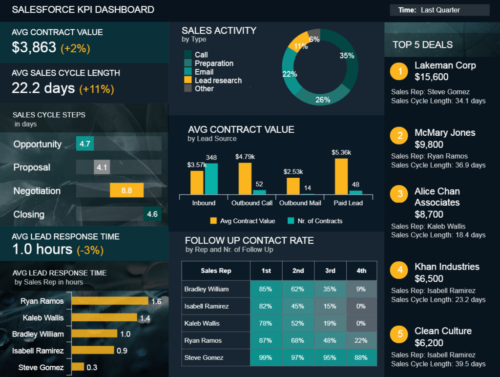
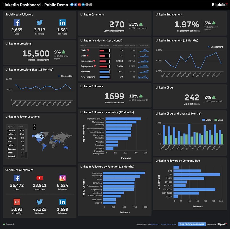
What Are Interactive Dashboards? Interactive dashboards allow users to interact with data visualizations, enabling them to explore insights, filter information, and gain a deeper understanding. These dashboards empower users to make data-driven decisions effectively. Benefits of Interactive Dashboards Interactive dashboards’ data analysis and visualization offer several advantages, such as real-time data exploration, improved data comprehension, quick identification of trends and patterns, and enhanced collaboration among team members.
Selecting the Right Data Visualization Tools
Popular Data Visualization Tools Choose from a wide array of data visualization tools like Tableau, Power BI, Google Data Studio, and more. Each tool has unique features and capabilities to cater to different data analysis needs.
Defining Dashboard Objectives
Setting Clear Goals for Your Dashboard Clearly define the objectives and purpose of your dashboard. Determine the key metrics and insights you want to convey to your audience.
Key Performance Indicators (KPIs) Identify the critical performance indicators that align with your dashboard objectives. KPIs will help you track progress and measure success.
Collecting and Preparing Data
Sourcing Relevant data analysis and visualization Gather data from reliable sources that align with your dashboard goals. Clean and preprocess the data to ensure accuracy and consistency. Data Cleaning and Preprocessing Techniques Explore data cleaning and preprocessing methods to handle missing values, outliers, and inconsistencies in your dataset.
Designing the Dashboard Layout
Creating an Intuitive User Interface Design an intuitive and user-friendly layout that guides users through the dashboard seamlessly. Focus on easy navigation and visual hierarchy. Color Psychology in Dashboard Design Understands the impact of colors on user perception and emotions. Utilize color psychology to enhance the dashboard’s visual appeal.
Implementing Interactive Elements
Adding Filters, Buttons, and Dropdowns Integrate interactive elements like filters, buttons, and dropdown menus to allow users to customize their data views. Interactive Charts and Graphs Explore different interactive charts and graph types to present data effectively. Choose the most suitable ones based on your data and audience.
Incorporating Data Visualization
Choosing the Right Chart Types Select the appropriate chart types that best represent your data and insights. Consider bar charts, line graphs, pie charts, scatter plots, and more, depending on the nature of your data. Best Practices for Data Analysis and Visualization Follow data visualization best practices to ensure clarity and accuracy in conveying information. Avoid clutter, use consistent scales, and provide clear labels and titles.
Enhancing User Experience
Optimizing Load Times and Responsiveness Optimize the dashboard’s loading speed to provide a seamless user experience. Ensure that the dashboard is responsive across different devices and screen sizes. Mobile-Friendly Dashboards With the increasing use of mobile devices, design your dashboard to be mobile-friendly, enabling users to access and interact with data on the go.
Adding Advanced Features
Embedding Videos and Animations Enhance your dashboard with engaging multimedia elements like videos and animations to make data storytelling more compelling. Real-Time Data Integration Explore the possibilities of integrating real-time data streams into your dashboard for up-to-the-minute insights and analysis.
Dashboard Testing and Feedback
Conducting User Testing Gather feedback from potential users and conduct usability testing to identify areas of improvement and refine your dashboard’s design. Gathering User Feedback and Iterative Improvements Embrace iterative improvements based on user feedback to create a dashboard that truly meets the needs and preferences of your audience.
Dashboard Security and Access Control
Setting Permissions and Restrictions Ensure data security by setting access permissions and restrictions for different users based on their roles and responsibilities. Encryption and Privacy Implement data encryption and privacy measures to safeguard sensitive information from unauthorized access.
Deploying and Sharing Dashboards
Hosting and Sharing Options Choose the most suitable hosting and sharing options for your dashboard, whether it’s on the cloud, an intranet, or through sharing links.
Dashboard Performance Optimization
Monitoring Dashboard Performance Regularly monitor your dashboard’s performance to identify and address potential issues related to data loading speed and responsiveness.
Tips for Speed and Efficiency Implement optimization techniques such as data caching and indexing to enhance the dashboard’s speed and overall performance.
Designing for Different Industries
Tailoring Dashboards for Specific Fields Customize your dashboards to cater to the unique data analysis requirements of different industries, such as finance, marketing, healthcare, and more.
Industry-Specific Use Cases Explore industry-specific use cases of interactive dashboards to gain insights and inspiration for your own projects.
Accessibility in Dashboards
Ensuring Inclusivity and ADA Compliance Design your dashboard with accessibility in mind, making it inclusive for all users, including those with disabilities, and compliant with ADA guidelines.
Designing Accessible Visualizations Learn about accessible data visualization techniques, such as alt text for images and screen reader compatibility, to ensure equal access to information.
Storytelling through Dashboards
Crafting Narratives with Data Master the art of storytelling with data by structuring your dashboard in a way that presents a compelling narrative and guides users toward key insights.
The Power of Storytelling in Presentations Understands the psychological impact of storytelling in presentations and how it can captivate audiences and enhance data communication.
Integrating Data from Multiple Sources
Merging Data Streams Integrate data from diverse sources and platforms to create a comprehensive and holistic view of your data for more informed decision-making. Data Connectivity and APIs Explore data connectivity options, including APIs, to facilitate seamless data integration from various sources.
Customization and Personalization
Allowing Users to Personalize Dashboards Empower users to customize their dashboard experience by providing options to personalize layouts, charts, and widgets. Custom Widgets and Modules Implement custom widgets and modules to allow users to add specific functionalities to their dashboards according to their preferences.
Troubleshooting Common Dashboard Issues
Identifying and Resolving Problems Familiarize yourself with common dashboard issues and learn troubleshooting techniques to address them promptly. Common Dashboard Errors and Solutions Explore typical dashboard errors and find solutions to fix them effectively, ensuring a smooth user experience.
Staying Updated with Dashboard Trends
Following the Latest Design and Tech Trends Stay current with the latest trends in data visualization and interactive dashboard design to keep your creations fresh and innovative. Future of Interactive Dashboards Gain insights into the future of interactive dashboards, including emerging technologies and anticipated advancements in data visualization.
Data Ethics and Responsible Data Visualization
Ethical Considerations in Data Visualization Be mindful of ethical considerations when presenting data, ensuring transparency, accuracy, and fair representation. Data Anonymization and De-identification Understand data anonymization and de-identification techniques to protect individuals’ privacy while using data for analysis.
Data-Driven Decision Making
Utilizing Dashboards for Insights and Decisions Emphasize the role of interactive dashboards in empowering individuals and organizations to make data-driven decisions confidently. Empowering Decision-Makers with Dashboards Highlight real-world examples of how interactive dashboards have influenced critical decision-making processes.
Leveraging AI and Machine Learning in Dashboards
AI-Driven Insights Explore the integration of AI and machine learning algorithms to gain deeper insights and predictive analytics from your data. Automated Data Analysis and Predictive Analytics Learn about automated data analysis and predictive analytics capabilities offered by AI-powered dashboards.
Scaling and Managing Large-Scale Dashboards
Handling Big Data in Dashboards Discover techniques to handle and process large datasets efficiently, ensuring optimal performance even with massive data volumes. Distributed Data Processing Understand the concept of distributed data processing and its application in managing large-scale dashboards.
Also Read: Scalability Issues in Back-end Development: Solutions for Handling Growth
FAQs (Frequently Asked Questions)
Q: How much technical expertise is required to create interactive dashboards?
A: While some technical knowledge is beneficial, many user-friendly Data Analysis and Visualization tools have intuitive interfaces that require little to no coding skills. However, understanding data analysis concepts and visualization best practices will enhance the quality of your dashboards.
Q: Can I create interactive dashboards for my personal projects?
A: Absolutely! Interactive dashboards can be valuable for personal projects, whether it’s analyzing personal finances, tracking fitness goals, or presenting data for academic purposes. Many free and user-friendly tools are available for personal use.
Q: How can interactive dashboards benefit businesses?
A: Interactive dashboards offer numerous benefits to businesses:
- Data-Driven Decision Making: Interactive dashboards enable businesses to access real-time and comprehensive data insights. Decision-makers can make informed choices based on accurate data, leading to better strategies and outcomes.
- Improved Collaboration: Dashboards facilitate collaboration among teams and departments by providing a centralized platform for data sharing. Employees can work together, analyze data collaboratively, and align their efforts toward common goals.
- Increased Efficiency: With interactive dashboards, users can quickly filter and drill down into specific data points, reducing the time spent on data analysis. This efficiency allows teams to be more productive and focus on value-added tasks.
- Identifying Trends and Patterns: Interactive visualizations make it easier to spot trends, patterns, and outliers in data. Businesses can gain deeper insights into their operations and identify areas for improvement or opportunities for growth.
- Real-Time Monitoring: Dashboards with real-time data integration allow businesses to monitor key metrics and performance indicators as events unfold. This enables swift responses to changing conditions and potential issues.
- Enhanced Client Communication: Businesses can use interactive dashboards to present data to clients in a visually compelling manner. Clear and engaging visuals can strengthen client relationships and build trust.
- Competitive Advantage: Data-driven decision-making and quick access to critical information give businesses a competitive edge. Interactive dashboards empower them to adapt swiftly to market trends and stay ahead of competitors.
- Resource Optimization: By analyzing data on resource usage and performance, businesses can optimize their processes, reduce costs, and allocate resources more effectively.
- Tracking Business Goals: Interactive dashboards allow companies to track progress toward their goals in real time. This helps in assessing performance and making timely adjustments to stay on track.
- Data Security and Privacy: Interactive dashboards can be designed with appropriate access controls and data encryption measures to ensure data security and compliance with privacy regulations.
By harnessing the power of interactive dashboards, businesses can leverage their data assets to make smarter decisions, streamline operations, and achieve sustainable growth.
Conclusion
In conclusion, mastering the art of creating interactive dashboards for data analysis and visualization is a valuable skill in today’s data-driven world. These dynamic and user-friendly tools empower individuals, businesses, and organizations to unlock the full potential of their data and make informed decisions with confidence.
Throughout this comprehensive guide, we’ve explored the essential steps and best practices for building captivating dashboards. From understanding the concept of interactive dashboards and selecting the right Data Analysis and Visualization tools to enhancing user experience and incorporating advanced features, each aspect plays a crucial role in creating effective and impactful dashboards.
Moreover, we’ve delved into the importance of data ethics and responsible data visualization, emphasizing the need for transparency, accuracy, and privacy in handling data. We’ve also highlighted the significance of storytelling through dashboards, which transform raw data into compelling narratives that resonate with audiences.
Interactive dashboards offer numerous benefits, from improving collaboration and decision-making to providing real-time insights and giving businesses a competitive edge in Data Analysis and Visualization. They facilitate efficient data analysis, enabling users to identify trends, patterns, and opportunities that can drive growth and success.
As you embark on your journey to create interactive dashboards, remember to continuously seek feedback and make iterative improvements to deliver the best possible user experience. Regular maintenance and updates will keep your dashboards relevant and aligned with changing data and user needs.


More Stories
Easy Conversion: What Does 170cm To Feet?
Prepare for a Delta Flight DL67 Emergency
Write a Cowboy Carter Review